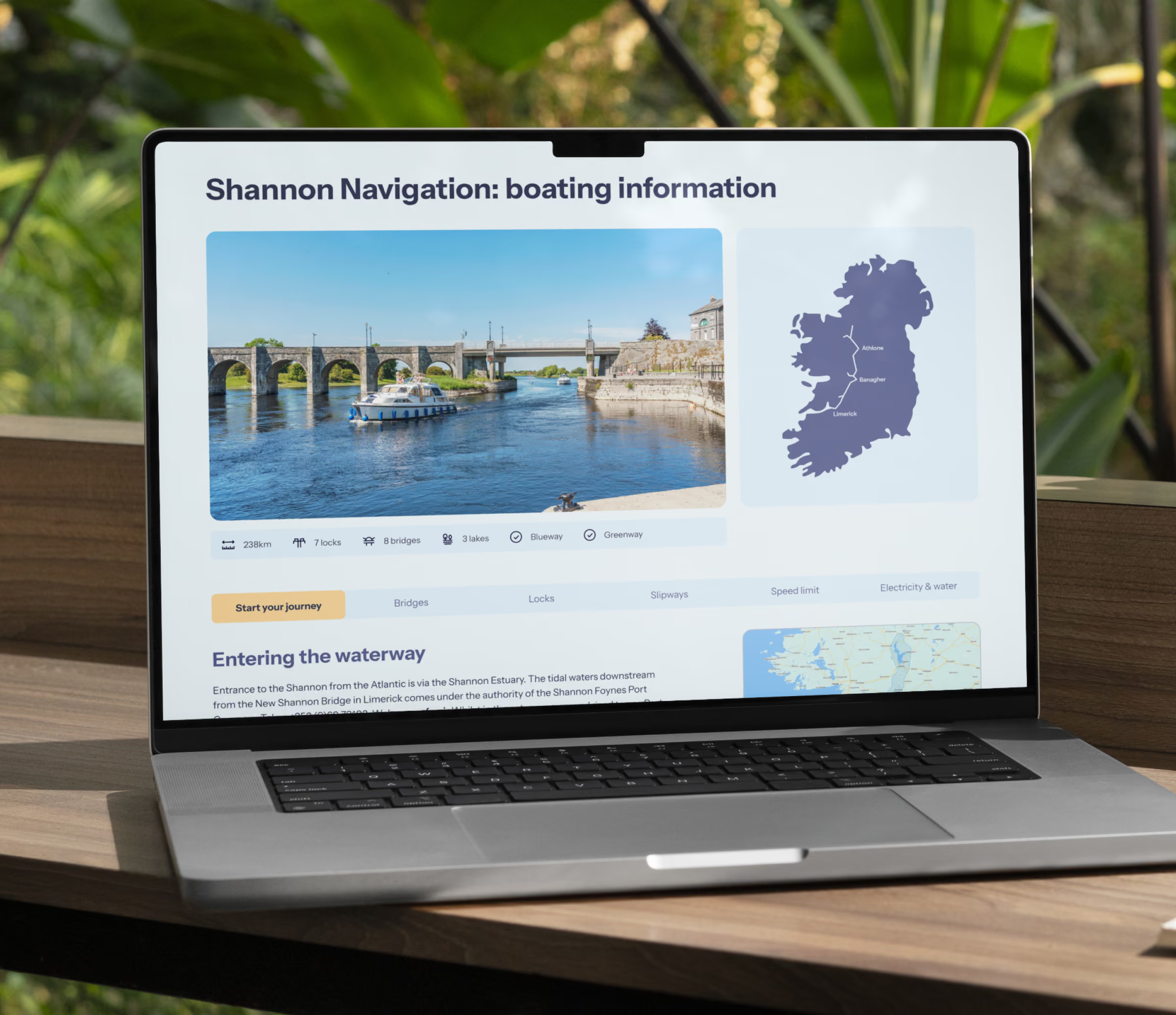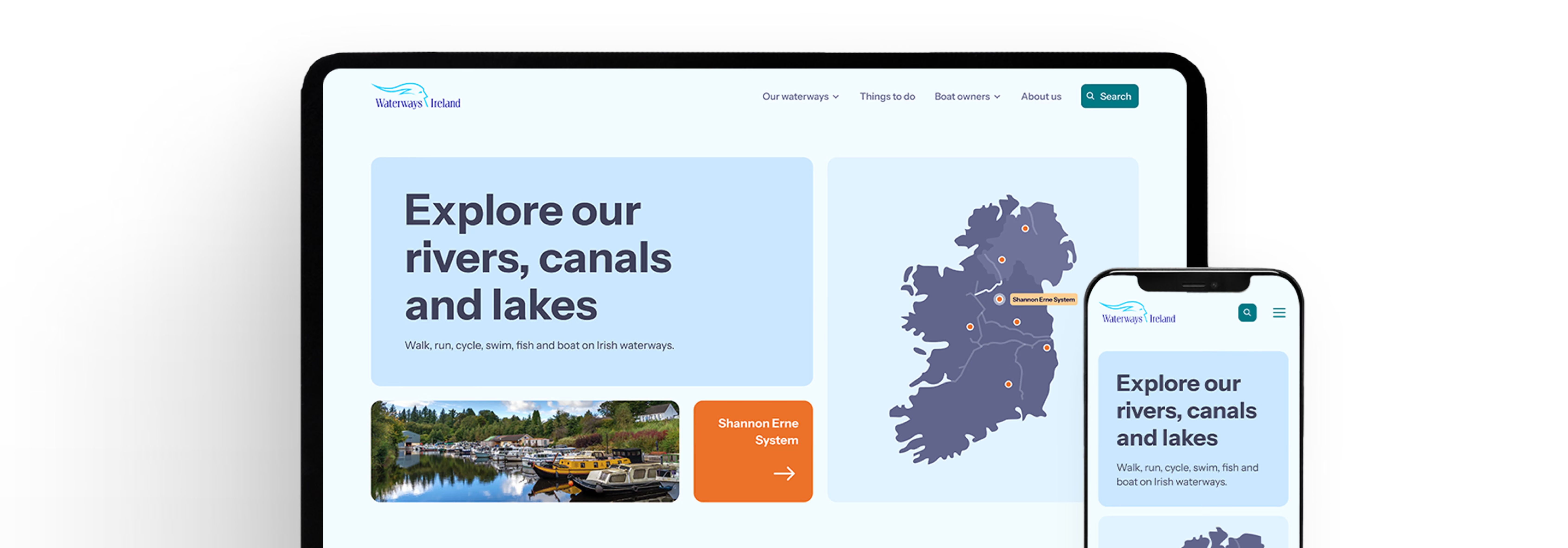
role: Lead ui designer
overview
A national body that had outgrown its website
Waterways Ireland manages more than 1,000 kilometres of rivers, canals and lakes across the island of Ireland, a huge range of activities, audiences and responsibilities, from boaters and anglers to walkers, cyclists and local communities. Its website was the front door to all of that, but it had aged badly: an outdated visual identity, a navigation people struggled to use, and a mobile experience that broke under real-world conditions.
Working as the Lead UI Designer, I collaborated alongside UX Designers and UX Researchers throughout discovery, but I personally owned the visual side of the project end to end, synthesising the research into a UI point of view, running the stakeholder workshop that defined the visual language, deriving the colour system, and building the entire design system and page designs that the new site was made from.
the challenge
Users were lost... and leaving
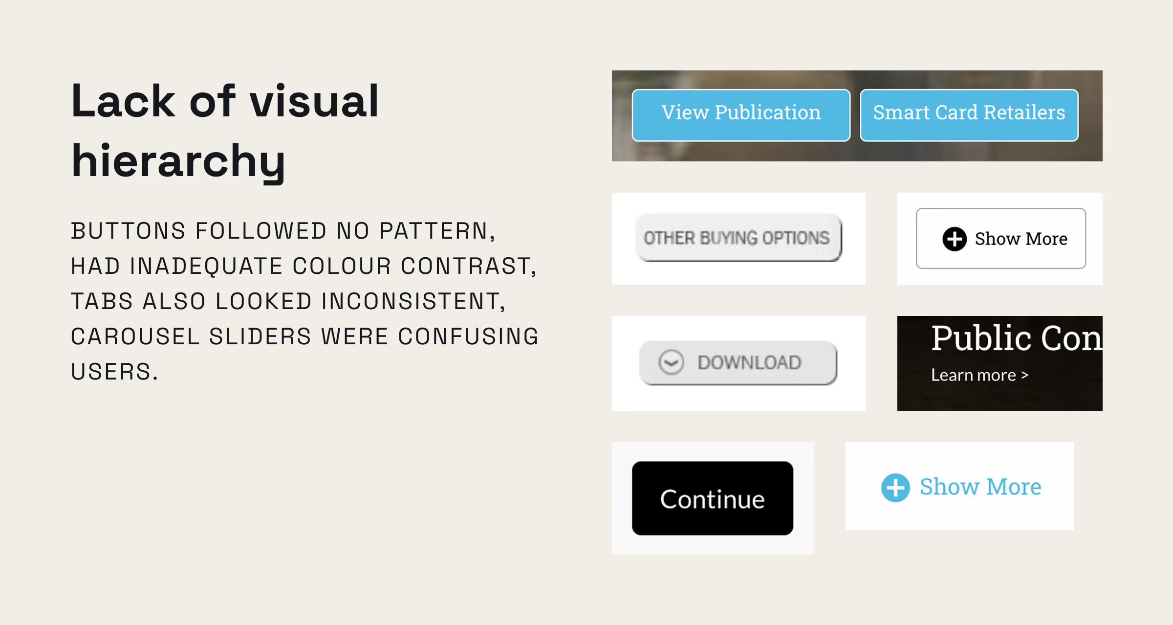
The behavioural evidence was blunt. Analytics and Hotjar showed people arriving with intent and failing to find what they came for. The core problems clustered into a few themes:
Underneath all of it sat a business risk: if people can’t complete tasks, they don’t register, don’t buy permits or smart cards, and don’t engage with public consultations. The redesign had to fix comprehension, consistency and accessibility at the same time.
the process
From evidence to a shared visual language
Turning research into a UI audit
Rather than treat the visuals as taste, I grounded them in evidence. I reviewed the analytics and Hotjar behaviour data with the research team, then produced a structured UI review that mapped every recurring inconsistency on the live site; inconsistent buttons and iconography, breadcrumbs that didn’t indicate the path, non-contextual repeated links, tab navigation that didn’t load content, unclear external links, insufficient colour contrast in the primary navigation, and form fields missing the guidance users needed to complete them. This audit became the shared problem statement the whole team designed against.
Facilitating the moodboarding workshop
I designed and ran a stakeholder workshop to define what Waterways Ireland should feel like online. It moved deliberately from brand to interface:
The value wasn’t just the artefacts, it was alignment. By the end, stakeholders and the design team held the same definition of success, which made every later decision faster to make and easy to defend.
the colour system
Deriving the colour system
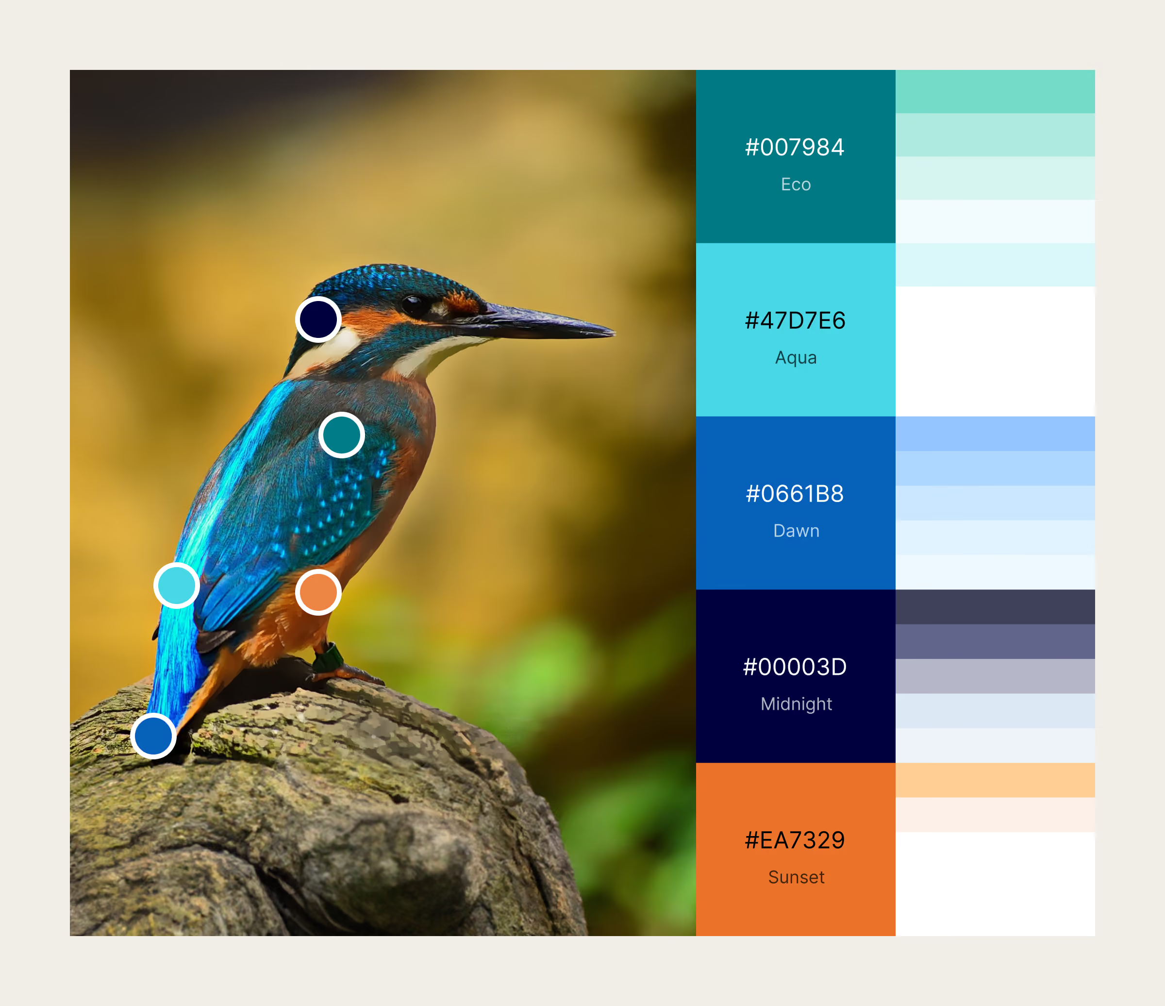
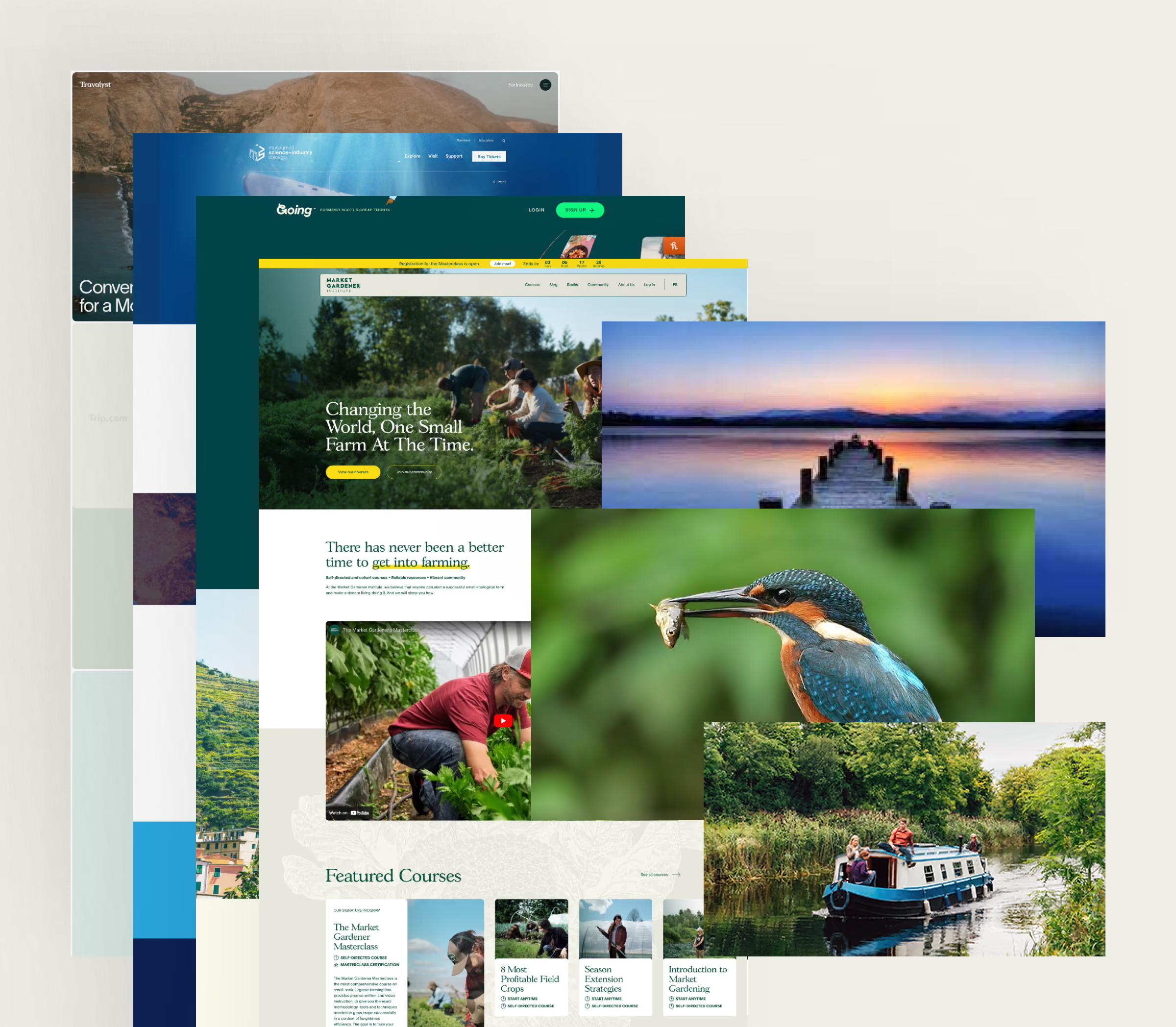
After the workshop with stakeholders, I started working on a UI concept and created a new colour palette for the brand incorporating the concepts that I was told define Waterways Ireland: water, nature, trust, warmth and balance.
The colour palette is anchored on the kingfisher, a bird whose presence signals a healthy waterway, and whose plumage gave the system a natural, credible source. I paired the core hues with lighter, harmonious tints engineered to work as backgrounds and accents while holding the contrast the audit had flagged as missing.
the design system
Danu: a design system, not just a redesign
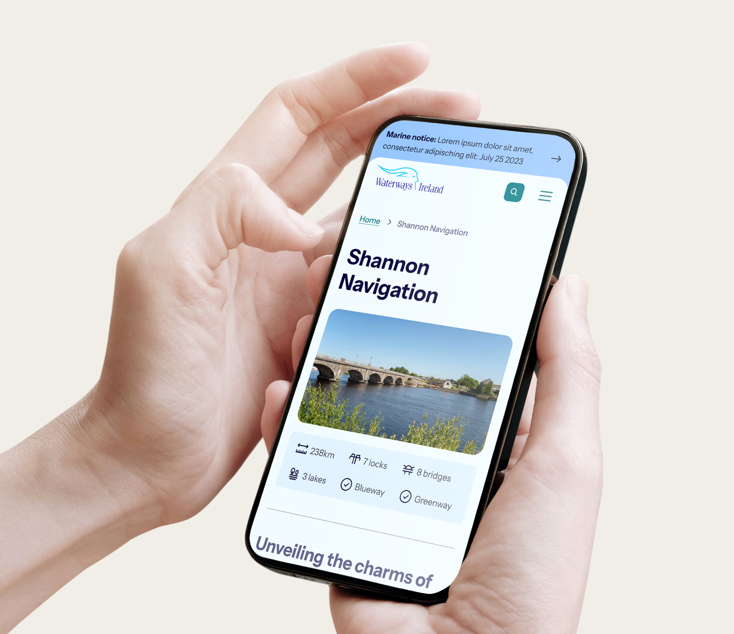
Named after an Irish Goddess, the design system Danu is the heart of my contribution to Waterways Ireland. Rather than design pages in isolation, I built a governed, multi-library system so that consistency was structural, not policed after the fact. It is organised as four connected libraries:
Each item carries an explicit status (ready, in progress, not started) and links between tokens and components, so the system is legible to designers and developers and can grow without drifting. This structure is the mechanism behind the accessibility result: contrast, state, hierarchy and semantics were solved once, at the component level, and inherited everywhere.
the results
Measurable gains across engagement, accessibility and revenue
+49%
+68.6%
+500%
+281%
On top of the excellent performance post-go-live, Waterways Ireland received a 100% score on accessibility from independent third-party auditors. This accessibility score is the result I’m proudest of, because it’s the clearest proof that the system-first approach worked: a perfect score on standard testing isn’t something you retrofit page by page, it comes from solving contrast, states and hierarchy once, in the foundations. The engagement and conversion lifts show the other half: when people can find things and trust what they see, they stay, read more, register and buy.
Reflection
What I took from it